Wednesday, July 08, 2015

Bloglovin :)

Follow my blog with Bloglovin!

Have you heard about Bloglovin? I hadn't but it seems like a fab idea! One place to manage all of the blogs you like to nosey at, so add mine? :) Any probs let me know, I'm new at it and would appreciate any feedback.

Dandelion Frame

I've had this stamp since Christmas waiting to be used and finally I've got round to it! (Cross posted to Crafty Magic)

Hero Arts stamps are my favourite physical stamps (as opposed to digital.) I'm even still using wooden backed ones from my crafty past! Still trying for a One Layer design which I almost managed on the one and failed on the other. (Managed to stamp the frame upside-down, don't laugh)


So stamps used -
Dandelion Frame CG153 Hero Arts.
Greeting is by Hot Off The Press (rather old stamp, but I like it.)
Butterflies are, I think, a recent docrafts set.

The wood paper is from a brilliant pad by Joy Crafts called Wood Texture Paper Block. Thought it would be super useful for boy cards too.

Marvel Age of Ultron Nail Card

Hi, back again! :) (Cross posted to Crafty Magic)

When my friends bf asked for a "nails themed" card I was somewhat challenged! But never say I won't tackle anything, because I will. :) (Please see earlier card involving Helicopter and Orang-u-tan lol.)

This is an Age of Ultron themed set of finger nails card. The nails were painted onto card "nails" and then shaped to try and recreate a fingernail effect. The are supposed to be ( I tried my best!) Hawkeye, Thor, Iron Man, Captain America and The Hulk - green version.


I hope she enjoyed it as much as I did making it. :)


I suppose you could use this as template to do any kind of nails, but I suspect it might be a bit of a niche market? What do you think?

Mirabelle

Grabbed any Mirabelle bargains? (Cross posted to Crafty Magic)

It's pretty obvious from the sale sections of crafty shops and stands at the NEC that the Santoro range called "Mirabelle" wasn't as successful as the Gorjuss range. My own thought is that the images were just too inflexible. If you don't colour the stamps in exactly the same way as the original image they look awkward, it's sombre pastels or nothing! We picked a lot of Mirabelle stamps, cards, toppers for £1 each at the NEC earlier this year and I hadn't felt very inspired to use them. After a good hunt on Pinterest and Google images, it seems hardly anyone has posted any cards using the range, well cards that I like ;)

Here are the two I made using the decoupaged ready coloured kits. I still haven't tackled the stamps, apart from using them to customise the envelopes for these cards.


Please note that none of my Mirabelle Cards are available on-line and can only be purchased from me personally at Fairs, for example. This is due to the Santoro Angel Policy which I think will be the same for Mirabelle cards as for Gorjuss Girl cards. I ain't risking it! ;)

The Otter

Annabel here! (Cross posted to Crafty Magic)

This year an Otter and family have decided to inhabit the River Severn in Bridgnorth and everyone has seen it but me!

My friend's partner has seen it numerous times when crossing the bridge so she ordered an otter themed card for his 50th birthday!


Allegedly the otter seems to wave as he drifts passed you..(He is rather tame.)...so this Otter waves with his left paw when you move his tail.

I painted the otter pieces using acrylic paints as it seemed the fastest option to get what I wanted. The background is a scanned marbled background that Helen and I made on one of our "mess and make background" days. And I wish I could remember where I got the bubble embellishments from... they were the last ones I had and they are perfect for watery images!

One layer black silhouette cards!

Bonjour! (Cross posted to Crafty Magic)

I've been really inspired by the "Keep-it-simple" and "One Layer Only" trends in card making at the moment. It's been very evident on Pinterest in the last few months. I wanted to have a go at a masked distress ink background directly onto the card and then black silhouette stamping on top of it. This is my first effort using distress inks blended in the background square (using a 12cm x 12cm mask) and then stamping on top with Versafine Onyx Black.


Stamps: Woodware JGS300 Going to Seed and Crafty Individuals Cl - 231 (Butterflies)

So as I was finishing off this set I remembered I had a rather nice unused set of Sheena Douglass " A Little Bit Scenic - Underwater Angels" I could use, and wouldn't this be ace with some water droplets or splashes on the distress ink background?? So... I carried on to this set.


I'm really happy with these, especially the two guppies on the left. ( The other fish on white are the envelopes for the cards.)

You might have spotted that the one fish card is not on one layer, but two. I found it super hard to keep the card clean! No blodges, marks, scuffs or... mess! To save a couple of the cards I remounted them onto a new card blank. And since they were no longer "One Layer" it meant I could justify adding some sequins -  I find it really hard to not use any embellishments. Although the seed head cards were more successful (at being one layer) I added some sequins to them too. I know... I think I have an addiction. lol!


Every stamp has a silver lining...

Hi! (Cross posted to Crafty Magic) 

I came across the following image on the Paper Parrot Blog (Via Pinterest) and was really impressed with it! (Click the picture to view the relevant blog post.)

http://paperparrot.blogspot.com.au/2014/03/occ-tracing-images.html?m=1

It seemed a really simple way of tackling flower stamps and making something with a completely different feel to it. I didn't have this set of stamps so I used a set of Joanna Sheen stamps from the Little Bit Sketchy collection called "Flower Power." As I  haven't got many pale inks, I stamped them using second generation stamping and Weathered Wood distress ink. It's not as beautifully coloured as my initial inspiration but I tried to do something similar using distress inks as watercolours - blobbing them onto an acrylic block, adding some water and then using them with a paintbrush onto the card. Once coloured I went over the stamped edges with a silver pen. A bit later it occurred to me that I could have just stamped them in silver to begin with??!??  But you live and learn! :)


Distress Inks - Weathered Wood, Peeled Paint, Fired Brick. Font - East Coast Stationery.

Gorjuss Tszujing?

 Who can resist Gorjuss Girls? (Cross posted to Crafty Magic)

Did anyone else sucumb to the offer at The Range for three new Gorjuss Girl stamps for ten pounds?


I couldn't resist! Plus my friend Grace bought me the "The Hatter" for my birthday and it just made me want more! This stamp is called "Sweet Tea" and was very simple to colour, so-much-so that I think I might do something completely different with it next time and perhaps some paper piecing might tszuj it up! ( No, I'm not sure how you spell it, but I'm not letting that stop me!)

This is a 5 inch square Easel Card. Image coloured with Copics. Santoro Gorjuss Stamp and Santoro Mirabelle Papers. Flowers from Hobby Crafts and Wild Orchid Crafts. Font is "Little Lord Fontleroy".

Please note that none of my Gorjuss Girl Cards are available online and can only be purchased from me personally at Fairs, for example. This is due to the Gorjuss Angel Policy.

Sarah Kay and Holly Hobbie.

Hi Again! (Cross posted from Crafty Magic)

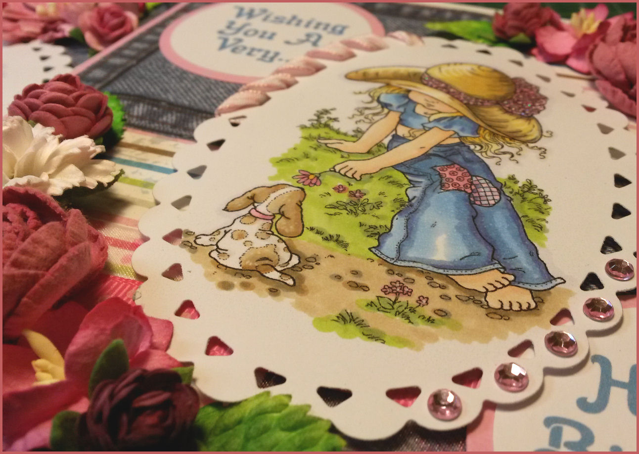
I had in an order for a 65th birthday card featuring Holly Hobbie.

I then set off to look for digistamps to download and use for the card but stumbled across a problem. I'd always thought that Sarah Kay illustrated a girl in a bonnet and patchwork skirt called "Holly Hobbie". Did you think that too? Turns out they are separate illustrators!


Holly Hobbie (born Denise Holly Ulinskas) is an American writer and illustrator, and the name of a fictional character she created. Sarah Kay is a character designed by the Australian artist Vivien Kubbos. Not the same! I chose some on line digital images that were freely available and attributed to Sarah Kay but the girls in bonnets could easily be Holly Hobbie.


I printed out the images and used Copics to colour them. I tried to restrict the colour palette and the images were quite small and detailed, so also opted for less is more. (Even though it seems like a lot of pens, this is a lot less than normal!)


Here is a list of the Copics I used for future reference - I am still not settled with my "go to" sets of pens for various effects....

Green - YG63, YG03
Yellow - Y38, YR31, Y11
Pink - R85, RV34, RV23, RV21, R20
Flesh - YR61, E00
Shadow outline - B60
Beige/Brown - W5, W3, W1, E31, E35
Blue/Denim - B95, B32, BV04

I made two cards in the end, mainly because they were such good fun to colour and they have now been safely delivered to the customer!


Paintfusion to PastelFusion

Here is a recipe for creating a one layer card (mostly) using paint fusion stamps (Or any flower stamp) on kraft card coloured with chalk pastels.

Here is what I did, I hope it inspires you and I would love to see what you make with it! :)


So I started with the Poppies Stamp Set and a 15cmx15cm kraft card blank and envelope.


Using white pigment ink I stamped the flowers and leaves on to the card blank not caring much about over lapping but trying to make sure everything would be covered up when I started to fill in the images.


Once the images were stamped it was all looking a bit complicated so I carefully traced around my flowers in red pastel so they were picked out from the line mess. Then I was able to work out which bits remaining were leaves. I added in any stalks that were missing at this point too. It was now clear what was what! :)


Poppies are darker coloured at the centre of the flower and lighter as they fan out - this picture shows the stages I went through. The bottom left flower shows the outline and dark centre part. Bottom right flower is 
blending in the red with a more orangey hue. Then to the central flower I added dark areas with burgundy/brown and at the edges white for highlights.  It is easy to blend colours using your white pastel, your finger, or a blending tool. It might be worth practicing a bit of blending first on scrap card.


At this stage everything had a base colour and basic shading but no detail at all. You can still see tiny bits of the original stamping but most of it is completely hidden. 
Some of the leaves needed more details picked out using darker green and white for highlights. I darkened the centre of my flowers with dark brown and added some wisps around the area where the seed head part would go.


Paintfusion isn't very detailed by nature ( part of its charm!) but with the pencil pastels I could more easily create more definition. I found some nice images online to use as reference material and then added black and green to form the centre of each flower.
I also added hairs to the stems of the flowers using fine strokes of  white pastel.


Once the image was coloured in I used a normal pencil eraser to clean off any smudges or marks I'd made. 

I also used a cheap can of hairspray to set the pastel so it would stay put!


After printing a greeting on the computer and adding a few gems - Finished Card!


I thought I would include the Sweet Pea version I also tried using the same techniques. 

I hope you fancy a go now too? :) Let me know how you get on, and ask any questions you might have along the way.